UI/UX Is Important for Time & Expense Tracking Software
When it comes to time and expense tracking software, the success of the solution depends on whether a designed interface can actually spark a user experience. It’s not surprising that employees despise filling out their timesheets, but a poorly designed interface certainly won’t make this process more palatable for them. In fact, it could make it more difficult and time-consuming – resulting in late timesheets and inaccurate data.
The “U” in UI/UX places the user’s priorities, satisfaction and ease at the core of the entire design and development process.
The software experience should encourage employees to track their time in a way that is faster, easier and more intuitive. It should be a seamless part of their everyday workflow rather than an interruption.
There are also a few more hallmarks that separate the cream from the water, so to speak:
- Shortens a user’s adoption time through easier training, which means a faster and more concrete ROI
- Simplifies the process of submitting and approving timesheets, so project accounting, payroll, and billing can be processed quicker
- Reduces timesheet errors and inaccuracies
The faster and more accurately your timesheets are processed, the greater the benefits. Users can save time, ensure projects are delivered on time and on budget, and increase billable hours.
10 UI/UX Principles for Time Tracking Software
According to Prototypr.io, there are 10 usability heuristics that are key elements of any user experience design – whether that applies to software, websites, mobile apps, or even non-digital experiences. These heuristics, when applied to time and expense tracking software, will heighten the user experience and result in quicker adoption, easier usage, and more accurate data – ultimately, boosting business profits.
If your time and expense tracking software follows each of these 10 fundamental UI and UX heuristics, your user acquisition rate will be a statistic that grows itself over time.
1) Clarity
Providing clarity through UI and UX in time and expense tracking software begins with a very fundamental question: How clear are the system’s functions to the user?
Does it provide feedback on processes?
The software’s design and development phases need to ensure that there are clear actions, messages and functionalities that tell the user about what the outcomes are of any given process or action/decision.
This helps subtly inform the user as to which actions are allowed, which are prohibited, how the system works and what it will and won’t do — in other words, its boundaries, capabilities and limitations.
Clear feedback should respond to questions like:
- Did my timesheet or expense entries save?
- Did my receipt upload?
- Were my timesheets or expenses successfully submitted?
- Did my leave request go through (and, as a bonus, was it actually viewed?)
 2) Familiar language
As a user moves through the exploration of the software, their actions should allow them to learn easily, over time, through repetition.
The main guiding question through this key UI/UX heuristic is simple: Is the language used easy to understand?
Jargon and formality have no function in places like messages, buttons, explanations, knowledge bases and technical help documentation.
Instead, every aspect of the time and expense software application should use current language and terminology and feature a friendly and informal voice.
The goal here is to make sure that the user knows exactly what will happen when they perform an action so they know what to expect.
At the very least, the language should not confuse or distract.
3) Navigation
When you hear “navigation”, you may think menus, sub-menus and sitemaps.
But navigation is about workflows, how easily you can click-click-click over to get something done in the software, move through the screens and enter important information.
There’s a rule in UI/UX principles called the “Rule of Three” (not to be confused with the layout-oriented “Rule of Thirds), that says that it should really only ever take a user three mouse-clicks to either find what they’re looking for or complete a basic action.
Successful navigation answers, “Yes!” to the following question: Does the system give the user control over the actions they perform?
It shouldn’t be hard for users to either navigate around the software’s functions or perform the most essential actions. They should also be able to:
- Find where to enter time and expenses easily, as well as request leave time
- Undo mistakes and decisions just as easily and without consequences, or without having to manually go back and undo every other consequence the decision affected
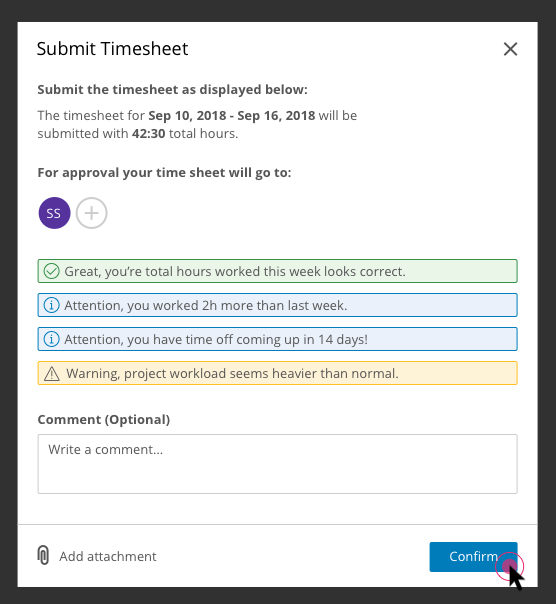
An example of this is entering and submitting billable hours that then get tacked on to a project’s “final” expenses.
When a user enters these hours, they should be given the ability to review what they’re about to submit before they confirm it. If there are any mistakes, it should be easy to cancel the submission.
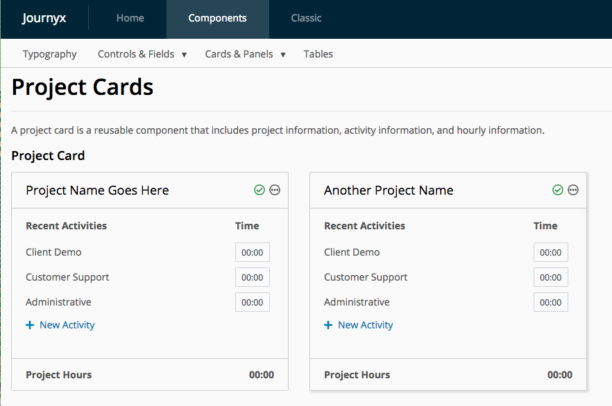
4) Consistent visual identity
Visual identity affects more than just the user experience. For a time and expense SaaS platform, user acquisition is built as much on the software’s functionality as it is on its visual identity.
Every time you acquire a user, you’re not simply building the popularity of the software, you’re building the brand’s recognizability.
Consistent visual identity in UI/UX focuses on two distinct and related aspects: One is the brand’s own visual and graphic identity (through logos, colors, buttons, animations, scrolling, graphics, fonts/typography, etc.) and the second is through certain standards.
For example, a circle with a “+” sign enclosed within it has become the digital user standard for a button that the user can press or click to “add” an item.
Because the user has particular expectations about familiar icons, your time and expense software should be capitalizing off these presets, but also preserving them for the user’s ease of use and implicit understanding.
It will save you a whole lot of extra explanation in your knowledge base and, for your user, significantly speed up the learning curve.
In other words, don’t reinvent the wheel. Simply ask the following: Does the system have a consistent look and feel, following basic industry standards?
Remember that if certain elements aren’t consistent, chaos and confusion will ensue. Every moment of chaos is a step-down on the user satisfaction scale.
Take a microscopic look at your design decisions:
- Do the buttons look the same and use the same calls-to-action?
- Do other graphical elements have a consistent look across screens and sections (ex. button conformity, heading stylizations, etc.)
- Is the language used standard across your software’s industry so that it’s easily understood (ex. “Gantt charts” in enterprise or PM software)?
- Is the performance of the actual user experience (speed, scrolling, lag-time, errors, etc.) consistent as well?
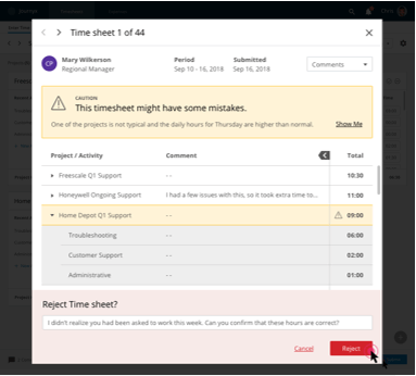
5) Smart error prevention
There’s no such saying as, “The most effective mistakes are the ones that are prevented” because we all learn from failure.
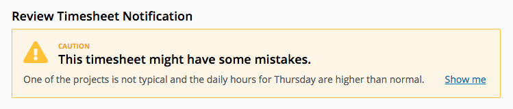
But the beauty of digital interfaces is that “failure” and “mistakes” are an option, especially if your software design is intuitive enough to anticipate where the most common mistakes happen and deliver timely messages to engage the user, warn them and offer suggestions for how to do what they’re intending instead.
Smart error prevention essentially asks: Does this system design help users to, for the most part, prevent errors?
If you’ve ever played video games, it’s like the ability to save before a big battle and restart in the middle — simple error prevention, right? You messed up, have another go at it.
But effective UI/UX design goes one step beyond — it mitigates the need for that proverbial “restart” by engaging with the user in real-time. And it can do so in a variety of ways:
- Through warnings and/or confirmations of actions they’re about to perform
- Through custom rules built-in that validate the data that users enter (without having to reload the form)
- Through timely messages about things they may have forgotten, such as attaching a receipt image or selecting a project or task to append the hours in their timesheet to
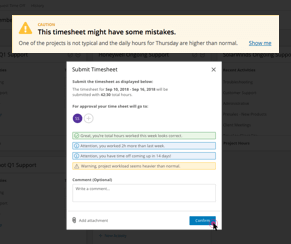 Effective UI/UX design is sensitive to interconnections. It knows that timesheet mistakes make processing more difficult and time-consuming. Instead, the system ensures that this doesn’t happen in the first place.
6) Automated information
How much do users need to recall to enter data? Well, “smart” time and expense software ensures that users only have to remember as little as possible (which also prevents errors).
Instead, the software can make the burden easier on the user by:
- Allowing the user to type in the first few letters of a project’s name and then selecting from a curated list
- Allowing the users to populate their current timesheets with entries retained from previous timesheets, presented to them as selectable options
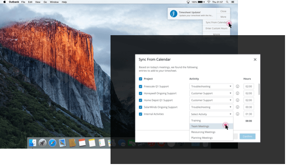
- Allowing data to be synced to timesheets from other applications (i.e. integrations) so that users don’t have to remember what they did or enter those items again manually
7) Supporting the learning curve
Because not all users have familiarity with time and expense tracking software, UI/UX principles don’t make any assumptions about their level of skill. Instead, the system’s design provides the built-in flexibility to choose between novice and advanced users.
To do this, they system should have options for both novice and advanced users to get what they need from it. This should including simple and advanced searching capabilities or complexity of reports generated, differentiating between basic to more detailed and advanced.
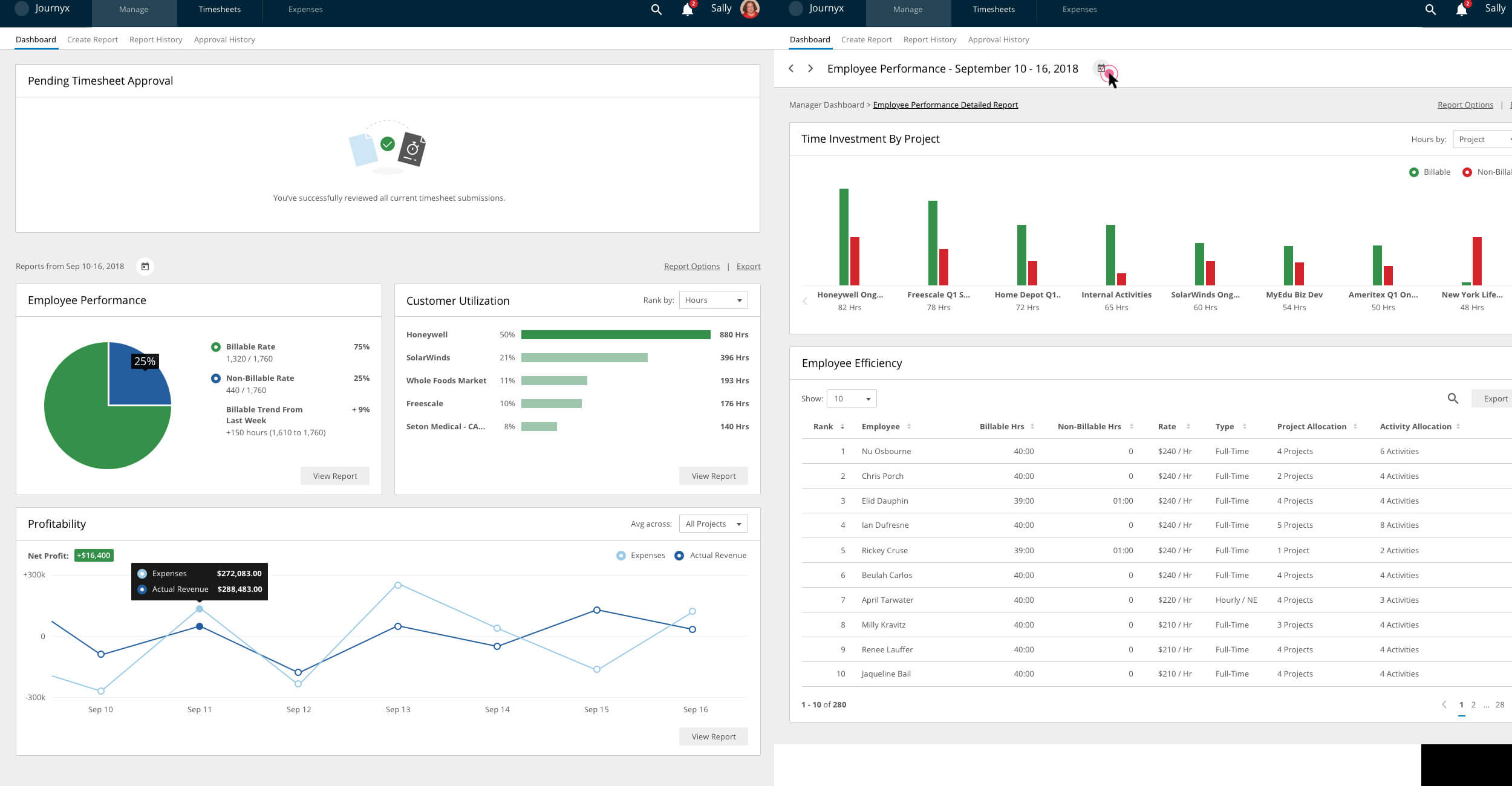
8) Information hierarchy
Information hierarchy is not so much about competition or worthiness of data, as it is about presenting the data in a manner that is easily digestible, comprehensive and relevant.
Information hierarchy is about telling a story and guiding the user through understanding, rather than simply bombarding them with too much upfront.
As such, every piece of information displayed on the interface needs to be necessary and useful. To do this, UI/UX designers will keep the design focused only on the elements that are useful to the tasks for that screen. They’ll also seek to answer:
- Can the user find what they need quickly and easily?
- Are there any extraneous elements that don’t support the goals of the screen?
9) Built-in error handling
Effective UI and UX design for time and expense software should help users recognize, diagnose, and recover from errors.
Yes, errors are inevitable, especially for beginner or novice users.
But the way a user learns is through relying on the system to tell them what they did wrong and giving them a clear, accessible solution. For example:
- Is the system specific about what kind of error occurred (for example, when entering incorrect login credentials, distinguish between an incorrect password, username, or both, and then give an option to retrieve the username or reset the password)?
- Does it give clear direction to help the user correct the error, i.e. which timesheet entry is missing data?
10) Thorough but simple “help” documentation
Because time tracking software can get pretty complex and granular in its use, your user should be able to gain help right when they hit a tough spot. Is there adequate and easy-to-find help documentation or options for support?
It’s the software design’s job to make this support readily available and empower the user to troubleshoot basic issues themselves.
- Are there links to help documentation available on every screen and, furthermore, do those links transport the user to documentation relevant to the screen’s current tasks?
- Is there on-screen assistance for an initial set-up?
- Are there tool tips or “pro” tips that give the users quick solutions or answers?
- Is help available in different formats (ex. written, visual, video, chatbots/messaging, etc.)
According to a report from McKinsey, companies that focus on user-centric design perform 10% better in revenue and acquisitions than their competitors.
Put yourself in your user’s shoes: If you’ve ever been “wowed” by the navigation, design and user-friendliness of working software, you’ll know that the experience is like being waited on by an attentive but unobtrusive English butler who works in the shadows, pouring your tea, answering the door and performing anything necessary to make your day easier (and his name is some variation of Alfred, or perhaps Jeeves).
And, like the presence of Jeeves, successful UI/UX is invisible. It supports a user’s intent and workflow, triggering a process that engages the user, anticipates their needs and then over delivers by responding in kind.


Let’s Get Started. Book a Demo Today.
Journyx helps you track time for projects, payroll, and more. Learn how Journyx can help you use time to your advantage in your business.